My Go-To Moody Blue Paint Colors
When it comes to color, you can never go wrong with a dark, soulful blue.

paint color / wallpaper / rug / chairs / bar cabinet / chandelier / table lamps / mirror / round leather placemats / dinnerware

BM Gentleman’s Grey. I used this in a client’s kitchen a few years back. It’s a deep blue that can lean a bit black and feels polished and modern.
SW Aquamarined This color is rich, bold and intense. We used this in our dining room refresh and it’s VERY GOOD.
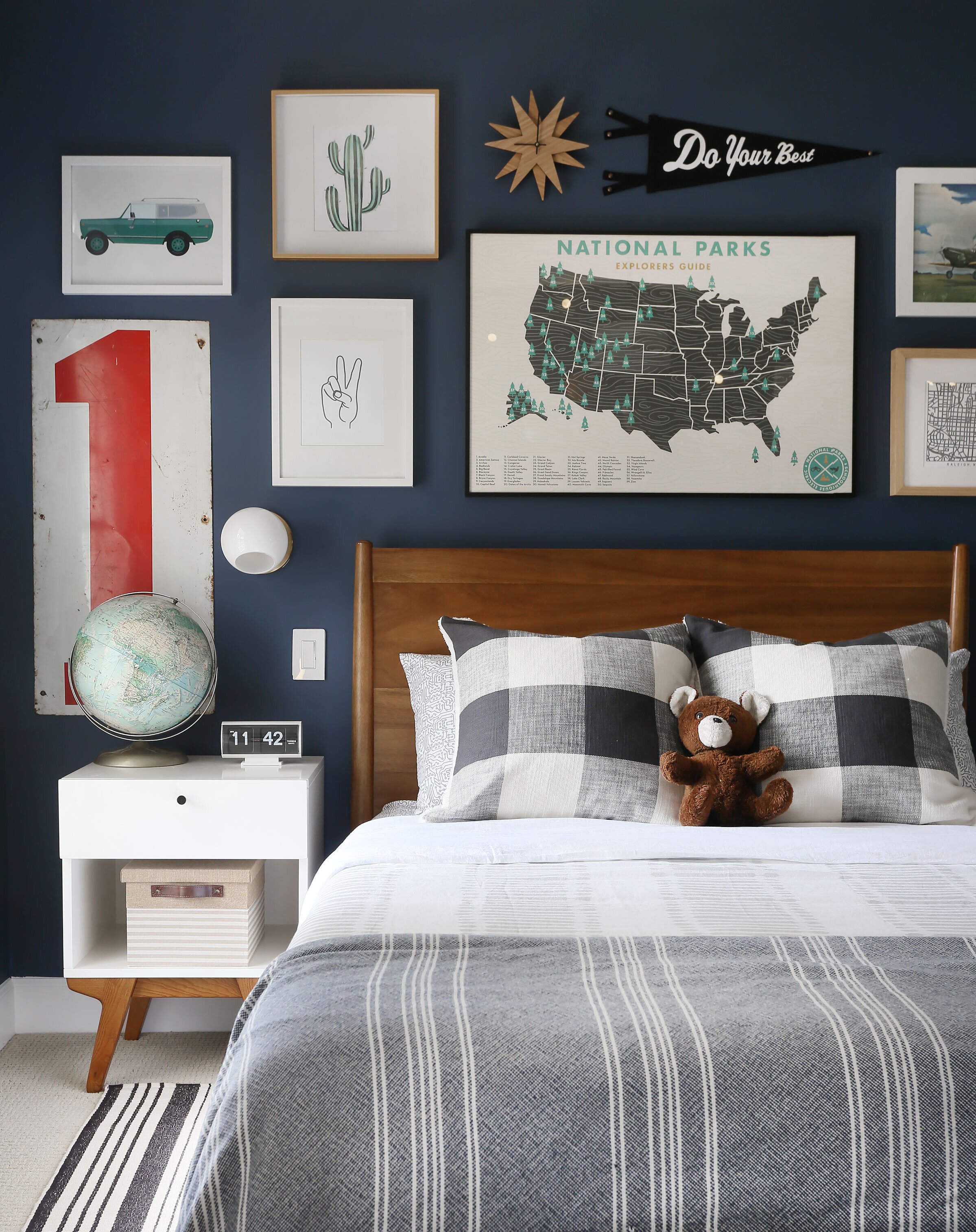
Farrow & Ball Stiffkey Blue Dark inky blue goodness. This color is a favorite across the internet and in our home too. We used this in our son Wyatt’s room.
SW Distance A lovely faded blue-ish gray that’s clean and simple.
SW Granite Peak Another great grey/blue option.
BM New York State of Mind A classic, elegant and rich blue.
BM Water’s Edge This is a beautiful, slightly muted green/blue that would look great in any style of home.
Farrow & Ball De Nimes This color is earthy and rich and looks excellent paired next to matte black.
Farrow & Ball Hague Blue Deep, dark and almost black. I love this color which is featured prominently in our home gym.


I hope you have enjoyed this little roundup!
Thanks for reading!