A Bold + Classic + Whimsical + Modern Powder Room

vanity (similar) / matte black pulls (similar) / storage basket / floor tile / wall tile / faucet / hand soap / towel ring (similar) / mirror / sconce (similar) / art / wallpaper / hand towel
Lots of adjectives flying around today! ha!
So truth be told…I love designing bathrooms and I especially love designing powder rooms! You can make a big impact in a relatively short time period because it’s a small and manageable space. For our particular powder room, we didn’t make any changes to the footprint, but just stripped the dated tile, pedestal sink and old toilet in favor of graphic (& amazing) wallpaper, classic and modern design finishes, lots of matte black and a little bit of whimsy thrown in for good measure.
Before we get into the good stuff, let’s see the before pics:


It’s not that bad but just not my style and I really wanted some storage in the vanity.
The space is a tiny little 5’ x 5’ dark square (with no window) so I felt it was my responsibility as a designer to spruce her up a bit and add some style and excitement! ha!
So, now let’s get into a few details!


The Vanity
I knew I wanted to keep all the elements clean and modern so I chose that simple white 24” vanity* with a marble top (I’m always forever your girl when it comes to marble) and paired it with the coolest matte black faucet you ever did see! I got the chance to tour the head quarters of Delta Faucet last year and see that matte black beauty in person and knew I had to use it for a project! I also swapped out the pulls that came with the vanity for a modern, rectangular matte black option (similar) to compliment the faucet. Matte black is what’s good!
I love the clean lines and also that extra bit of storage that I was lacking with my old pedestal sink really makes a difference in this small space.
The Tile
In keeping with my theme of modern and classic, I chose a timeless hex marble tile (with white grout) and paired it with a 2 x 8 subway tile in a more modern vertical stack design (grout is Excel whisper grey). I love how it feels old and new at the same time!

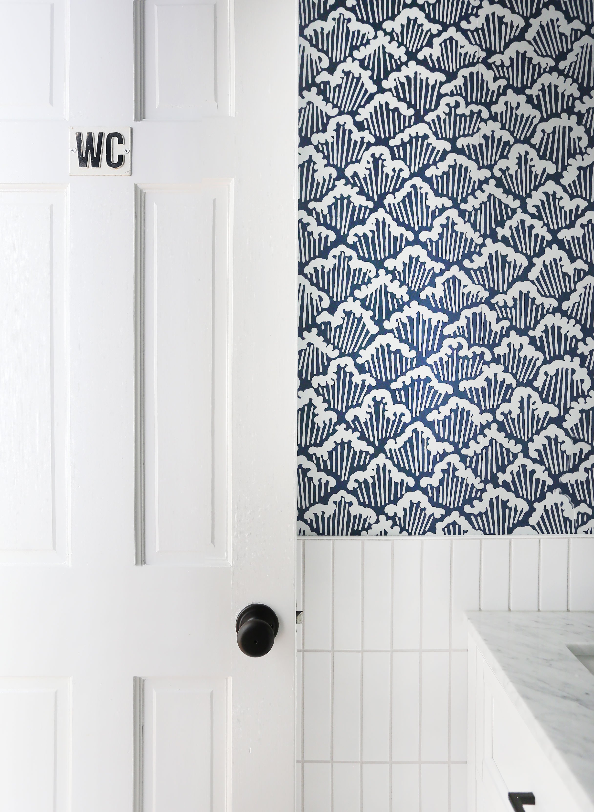
The Wallpaper
I have actually loved and admired that wallpaper for many years now and was thrilled to be able to use it in my own home! The paper itself is stunning – so high quality with this amazing subtle texture that gives the room dimension and most importantly, style and character! And I love the playful and somewhat eclectic pattern..some people see waves (me), some see trees, some see cupcakes (my daughter)…what do you see?

The Brass Accents
I have mentioned my love of matte black (which is fairly recent) and would be remiss to not mix in some brass (OG love) in the design. Because matte black and brass go together like bacon and eggs! The brass in the gorgeous oversized sconce (similar), the rounded mirror and the frame on the naked lady art add a layer of warmth and soul to this tiny space.
So that about wraps things up! I truly love how it all turned out and I hope you guys do too! I rounded up all the sources below in a handy little graphic in case you are interested!
